entertainment.ie Android app review
I have always liked entertainment.ie. The sheer volume of stuff that's on and I didn't have a clue about always impresses :) The android app is a bit mixed in design and usability, but it does give you what you asked for - listings of stuff to do.
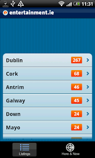
The opening page is a scrollable list of counties with a number of events beside them. They are ordered by number of events which is a bit silly. Alphabetically would have been better, or cleverer still - by distance from the user. Not that hard on a handset and a feature that was also ignored on yesterday's app.
 One of the issues with mobile devices is their small screen sizes. People like Apple and Google have done a lot to alleviate these problems by hiding menus offscreen when not in use, removing unnecessary borders from screens and generally reducing clutter. This aligns them well with the current trend for clean interfaces like twitter. entertainment.ie however have cut a big chunk out of the interface. Somebody somewhere mentioned that this was for the follow us on twitter button, but it's just blank on my download. Maybe they fell out with twitter and did not rearrange their UI. Either way is makes the navigation on the app feel like typing through a letterbox. Bit fiddly in other words.
Clicking on a county gives a list of categories - stuff like Cinema, Festivals (and Festival? - oops). Still the chunk missing out of the top of the screen.
After that it is the individual cinemas. Naturally we are not all globe or even country trotters and being able to set a default cinema would be good. Even if that just floated to the top we would be on to something, but as it is it's a messy way to get get to the same cinema every time.
Once inside a particular listing - like a film - you can click on the Review button. This brings you to a review from the entertainment.ie website. However there are 2 big buttons on the bottom of the screen - one for exit and one for back. They both do the same thing and considering this is Android they should not be there at all. That is what the back button is for.
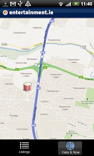
Finally we have the Here and Now tab. This uses the phone location features to find out where you are and show you a map with nice icons showing what is on. I did not show you where I live (marked by a blue dot on the map) because there is nothing on :(
Ah well - can't blame entertainment.ie for that. This does however seem like a nice feature - for people who live in a main city.
Overall rating: 6/10.
Will it be staying on my phone? No. Not really the apps fault though. With a small baby we don't get to go out very often and know that there is loads of stuff on does not help!
If you have more free time on your hands than I do, then you can get the app here:
https://market.android.com/details?id=com.entertainment.ie
The opening page is a scrollable list of counties with a number of events beside them. They are ordered by number of events which is a bit silly. Alphabetically would have been better, or cleverer still - by distance from the user. Not that hard on a handset and a feature that was also ignored on yesterday's app.
 One of the issues with mobile devices is their small screen sizes. People like Apple and Google have done a lot to alleviate these problems by hiding menus offscreen when not in use, removing unnecessary borders from screens and generally reducing clutter. This aligns them well with the current trend for clean interfaces like twitter. entertainment.ie however have cut a big chunk out of the interface. Somebody somewhere mentioned that this was for the follow us on twitter button, but it's just blank on my download. Maybe they fell out with twitter and did not rearrange their UI. Either way is makes the navigation on the app feel like typing through a letterbox. Bit fiddly in other words.
Clicking on a county gives a list of categories - stuff like Cinema, Festivals (and Festival? - oops). Still the chunk missing out of the top of the screen.
After that it is the individual cinemas. Naturally we are not all globe or even country trotters and being able to set a default cinema would be good. Even if that just floated to the top we would be on to something, but as it is it's a messy way to get get to the same cinema every time.
Once inside a particular listing - like a film - you can click on the Review button. This brings you to a review from the entertainment.ie website. However there are 2 big buttons on the bottom of the screen - one for exit and one for back. They both do the same thing and considering this is Android they should not be there at all. That is what the back button is for.
Finally we have the Here and Now tab. This uses the phone location features to find out where you are and show you a map with nice icons showing what is on. I did not show you where I live (marked by a blue dot on the map) because there is nothing on :(
Ah well - can't blame entertainment.ie for that. This does however seem like a nice feature - for people who live in a main city.
Overall rating: 6/10.
Will it be staying on my phone? No. Not really the apps fault though. With a small baby we don't get to go out very often and know that there is loads of stuff on does not help!
If you have more free time on your hands than I do, then you can get the app here:
https://market.android.com/details?id=com.entertainment.ie


Comments
Post a Comment